Glamazon bold composition, all items are rotated with the Glamazon logo on a purple band, and other graphic elements on the corners

Glamazon Pride Brochure

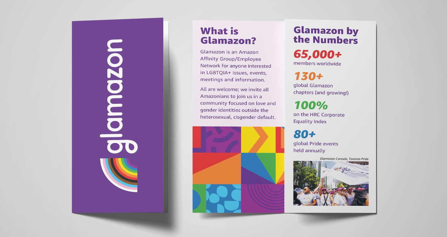
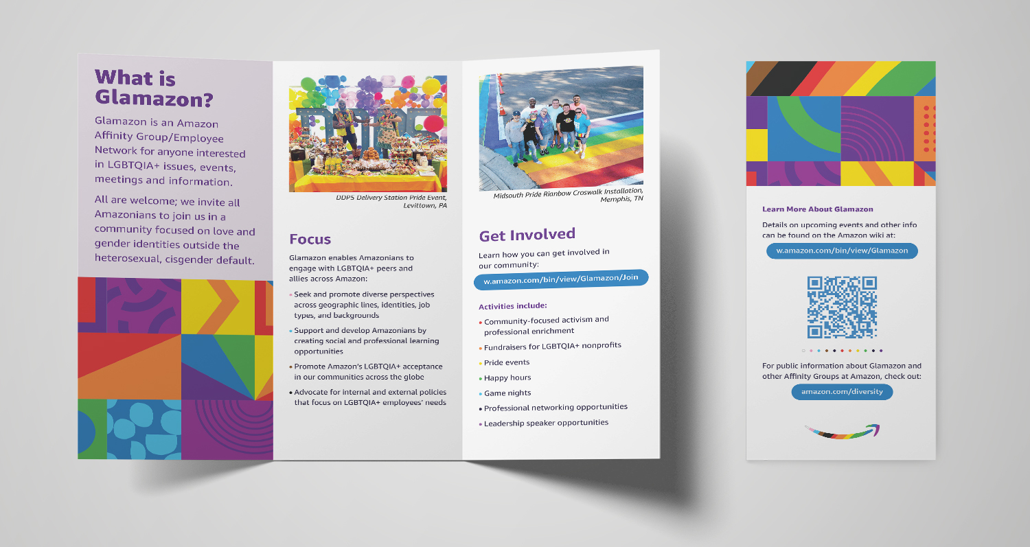
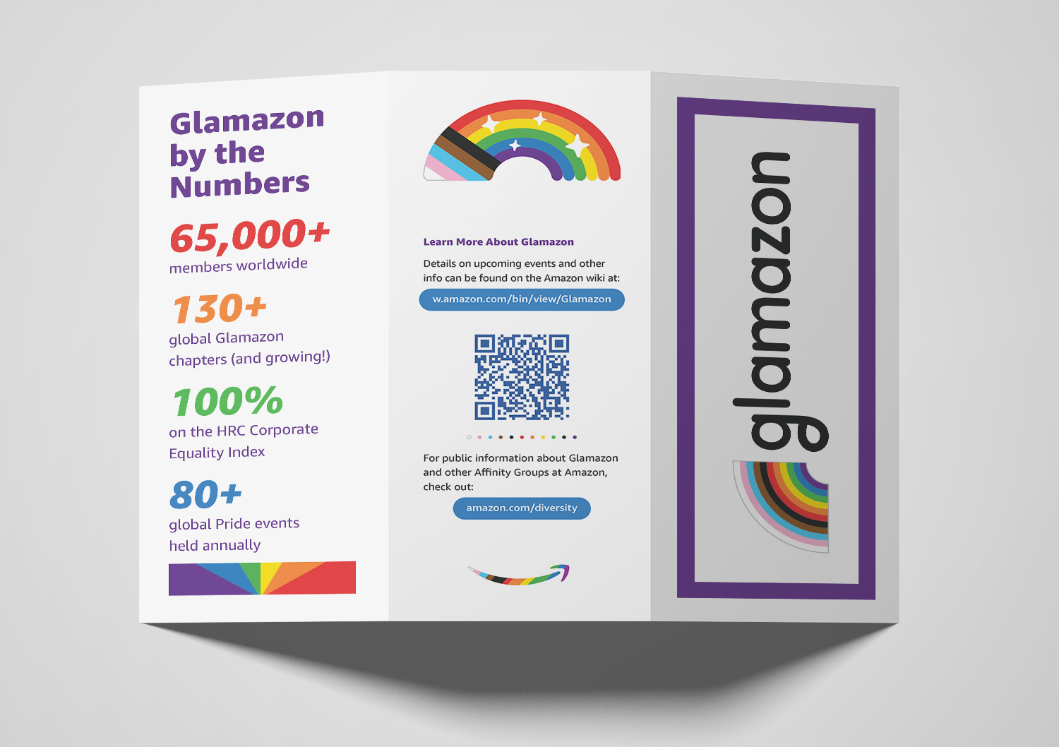
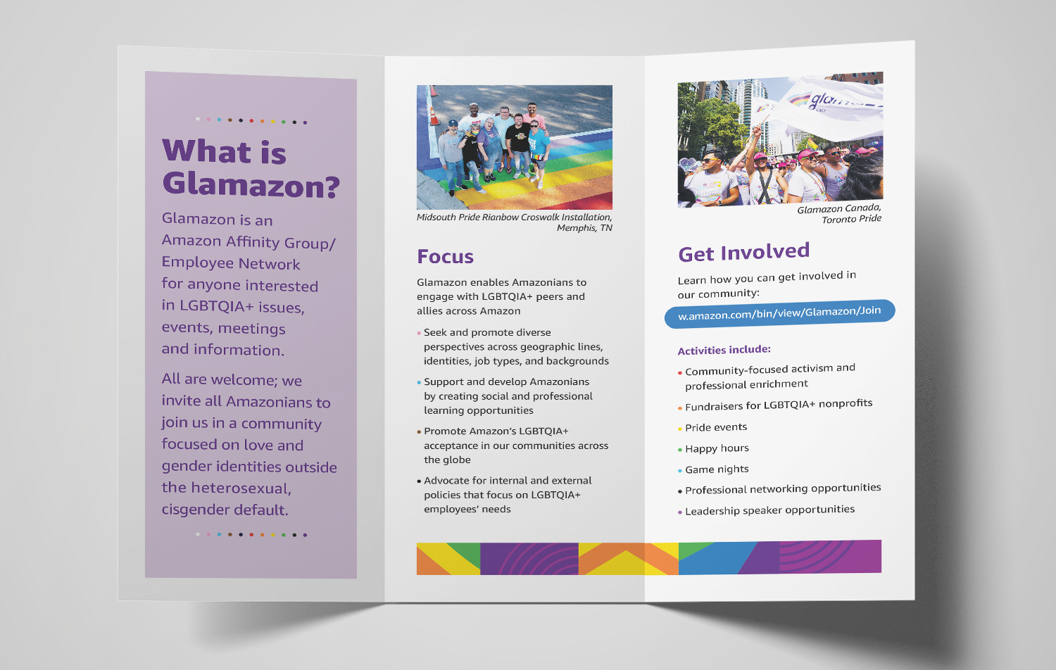
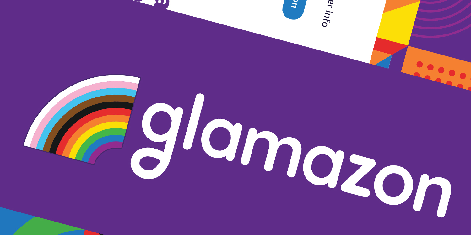
Glamazon is Amazon’s LGBTQ+ interest group. As a volunteer designer, one of my projects was to revitalize the annual Pride event brochure. Jumping off the recent Glamazon rebrand, I proposed creating two versions: one optimized for design to be printed professionally, and one optimized for desktop printing. This approach struck a balance between production simplicity and visual impact.
  • Role: Designer
  • Client: Glamazon (Amazon)
  • Employer: Glamazon Design Committee (Amazon)
  • Engagement: Layout design, production strategy
  • Impact:
    • Users self-served and were able to pick the version that best suited their needs without friction
Glamazon brochure
Glamazon brochure cover and first open Glamazon brochure inside and back
Secondary version of the brochure, with wide margins and increased negative space to compensate for limitations of desktop printing and reduce ink coverage.
Secondary Glamazon brochure, outside view Secondary Glamazon brochure, inside view

Process

  • After receiving the brief from the art director, I studied the new style guide and discussed its uses and parameters. I also reviewed the previous year's design.
  • I initially proposed three designs, a high-end design for partners that could work with printers, a mid-level design that could be sent to Vistaprint, and a simpler design that could be easily printed from the office. With feedback from the art director, we narrowed it down to the middle and simpler designs to simplify the workflow.
  • After a couple of rounds of revisions, we presented the designs to the national board, who approved them with minor tweaks to content.
  • The files are distributed through the Glamazon digital toolkit. Each partner chapter can take either version of the brochure and output it as needed.

Work Samples